This was originally written by me on Medium years ago, but now it's here.
Over the past few years, as a founder of a product design and development company, I’ve been thinking a lot about a little question. What is the impact of technology on humanity?
Among startups and traditional companies, I hear an onslaught of terms about the user. But the user is one person. What about the impact on all people? That’s what led me to humanics.
Merriam-Webster defines humanics as “the subject or study of human nature or human affairs.” But I think there’s a lot more to humanics than that, and we’re only getting started.
Consider this: Only 29.4% of the global population has a smartphone. Just 2.1 billion people, while the global population is at 7.4 billion.* With that in mind, we have to realize a lot of what’s being made today is going to be adopted by people who won’t necessarily understand why a floppy disk icon means “to save”. Or why you need to swipe to unlock. Or what the hell Yelp is, or why it matters.
While these new markets are being on-boarded to a pre-existing infrastructure, the existing smartphone market will be throwing away their year-old devices and getting shiny new ones. What happens to these old devices? The technology within them is not useless, but software upgrades often cripple them to a point that renders them unusable.
What you’ll read next, if you’re willing to follow me on this journey, are questions asking why we design and build for business models and existing infrastructure first, and human needs second. A proposal for change. And questions about the feasibility of this idea itself.
Rethink about it
Take what you think of as an operating system is and light it on fire. Burn it to the ground. Now let’s clean up the ashes, and ask ourselves, “What’s the point of this technology we carry with us everywhere we go?” Think about why we’re glued to these tiny rectangular objects that travel with us more than our significant others — more than our loved ones — more than our friends. In more places than we carry cash, we carry our phones.
In more places than we carry cash, we carry our phones.
This wasn’t the case two decades ago. Two decades ago I remember going to a friend’s house and knocking on the door to find out if they wanted to hang out. A decade ago I was using a Sony w810i to text my friends to find out if they could hang out. I browsed text menus with roughly 20 keys. 10 of them were numbers. Now I have 20 different apps that do the exact same thing. How should I contact them today? Should I text them? Message them on WhatsApp? Google Hangouts? Facebook Messenger? Twitter? We’ve really been solving the same problems a thousand different ways, while adding the burden of maintaining each product we now use.
I’m talking about you, Widgets on Android. I’m talking about you, folder systems on iOS. I’m talking about you Windows Phone app store. This paragraph isn’t to rag on applications, most of them have a point. They have an economy. They solve a problem. They do something. But at the end of the day, 99% of these applications do the exact same thing as something else, just slightly different. Everyone is a snowflake.
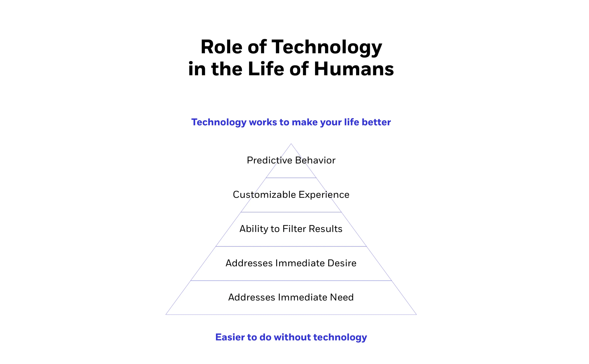
Given that technology has improved so dramatically in the last ten years, we should be looking at the way things could be, rather than the way things are due to the technological environments we’ve constructed. Maslow’s Hierarchy of Needs is a useful tool in determining human needs, but we don’t really have an equivalent set of rules for a technology settings.
Shouldn’t we start to look at the way we use our phones? Maslow’s Hierarchy of Needs might not be the worst place to start. But that pyramid graphic I’ve seen a million times, and can vaguely recall from my anthropology class in college, should be questioned as well. The majority of applications out there solve for one of two things. Wants, or needs.
Companies today are building applications to solve problems at scale in order to generate revenue at scale. There’s only so far that you can scale now before you have Earth as your target demographic. Companies of tomorrow will be about creating invaluable assets and services that contribute to the users and ecosystems of the future. In order to be competitive, and gain the business of users, companies will need to consolidate and dismember the very applications they created to hone in on the elements their customers find most valuable. When users have the option to obtain anything they want within a matter of taps, why will they choose you over your competitor? It’s going to be because of the assets you have, the services you offer, or the experience you provide–at a cost that makes sense. Most companies today try to synthesize all three of these things into one full package, but few are actually good at it. Not only that, but because these experiences are not ubiquitous, it means every experience will inevitably be different, which means further experience atrophy for everyone.
We’ve seen this time and time again with any number of companies and applications, legitimate or not, trying to force a user to live in their own experience regardless of user demand. It’s as simple as this: People want access to stuff. And if you’re going to try to get in their way, they’re going to get around it. It doesn’t matter if you’re an industry that’s existed for 100 years, or a platform that’s existed for 5. Users have the power to make you powerful, and they have the power to destroy you. And if you’re not going to be on the side of the user, or you’re going to try to tell them how they should access their stuff, history points to a future for you that is largely unfavorable, and ripe for disruption.
There’s a reason Walmart hasn’t burned to the ground and why Comcast is still in business. It’s not because of their wonderful customer service. It’s because of consolidation.
…there’s only two ways I know of to make money: bundling and unbundling.
Jim Barksdale
There’s a rich and healthy environment we’ve discovered with the advent of mobile platforms that’s helped move the power and reach of consolidated behemoths to many startups who half the world hasn’t even heard of. But what’s been overlooked, and seemingly forgotten during the last decade of application development, is the human experience. I’m not talking about 44px tall buttons that Apple describes in their Human Interface Design guidelines, I’m talking about the mere existence of humanity. Remembering who we’ve been building businesses and applications for to begin with. Who are we solving these problems for?
It seems like a lot of this has been overlooked because operating systems and development environments today encourage application development. It’s not like it doesn’t make sense.
Think about what you spend the majority of your time doing on your phone. Nine times out of ten you’re looking for something. You’re checking your email, you’re getting directions, finding a place, searching for an answer, checking in with friends. Now think about the number of applications you use for this. Chances are it’s not three, it’s about a million. Or maybe less — but still quite a bit right? Now think about how many of those do the exact same thing, and they deal with the same thing. Content.
Content is king. But–content doesn’t need to be presented in a brand new way every time you pull your phone out of your pocket. Why do we need to design entirely novel ways of interacting to find out the same information? I’m not asking why we need to iterate or improve. I’m asking why we don’t share a common core. Some applications borrow from each other sure, but each experience is about as varied as can be. Current mobile operating system environments hide information by masking it in the form of applications. This forces users to learn new ways to navigate in order to acquire the same information they could find in competing applications.
Here are a few examples:
I need a place to stay, so I could check AirBnB, Hotels Tonight, Kayak, HipMunk, Bing…you get the idea. But I need the same information from all of these sources. I need prices, location, availability, and images of the location. Each of these applications has a completely different interface, and costs the user significant amounts of time and energy. They need to download each application, create an account, and follow that up with learning the interface for said application. Each application has its own set of terms, payment, checkout process. If you can imagine a step along the way, it’s different across the board.
Say I want to check up on friends or family: I could check Facebook, Twitter, Instagram, Flickr…etc. The media is the same. It’s all going to be photos, video or text, yet the application traps all of the content. Why? To drive user behavior towards an end goal of more clicks, more ads, more…whatever. One could argue applications help push experience forward by creating competition. Tinder changed the online dating scene by reducing browsing to a swipe. The same could be done for many other contexts.
These examples are just a few of literally tens of thousands, but now is as good a time as any to step back think about why we’re actively building forward in this direction.
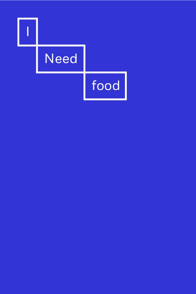
Why isn’t there an operating system that caters to the needs of humans first?Why aren’t we solving for the way humans function, and not the way the market or environment happens to be? As humans we’re solving for one of two things — wants or needs. I want knowledge, answers, services, or a wide array of other things. Wants gets very hairy, very quickly. Needs on the other hand are very rudimentary. I need food. I need water. I need shelter. If you’re with Maslow you’re also needing sex here, but I’m less interested in going down that rabbit-hole right this second, so let’s just go with food, water and shelter.
Whether or not this manifests as an operating system itself, or an all encompassing application like Finder in MacOS, what’s most important is what the resulting environment ends up accomplishing.
Part 2: The Concept and Foundation
The following tenets explain the of concepts and foundation of a theoretical operating system called Humanic. A system centered around human needs first and foremost.
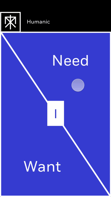
The goal of Humanic is to get out of the way in order to become a digital companion to human nature by addressing basic human wants and needs. It’s less important that something is or is not an application. What is important is addressing user intent as quickly and efficiently as possible. In order to do so the focus is on creating a lightweight structure that can work together harmoniously.
What is important is addressing user intent as quickly and efficiently as possible.

The structure of Humanic is comprised of three pillars: Experience, Functionality, and Media. Each pillar is defined by a series of elements.
1. Experience
The experience is what people will be directly interacting with most. They may not understand the way something works behind the scenes, but they will know what they are looking for, and how they expect to get there.
Intent
This is the most fundamental part of why Humanic exists. Without intent, there isn’t a purpose for a Humanic Operating System.
Constitution
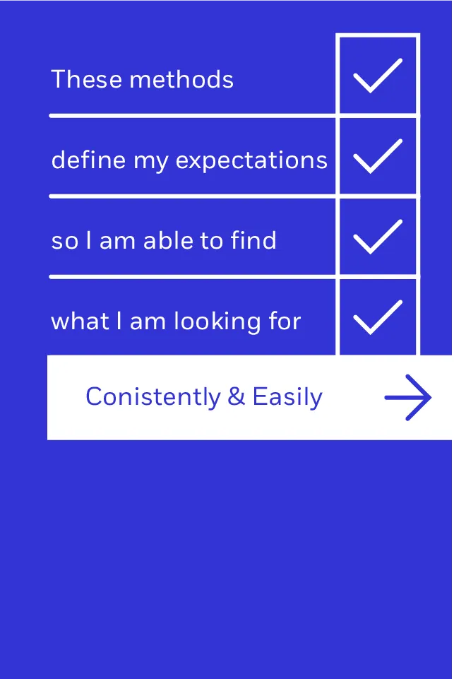
An set of expectations established by users that define the methods by which users aim to pursue intent.
Interface
What the user sees, interacts with, and assumes is doing the work in the pursuit of their intent.


2. Functionality
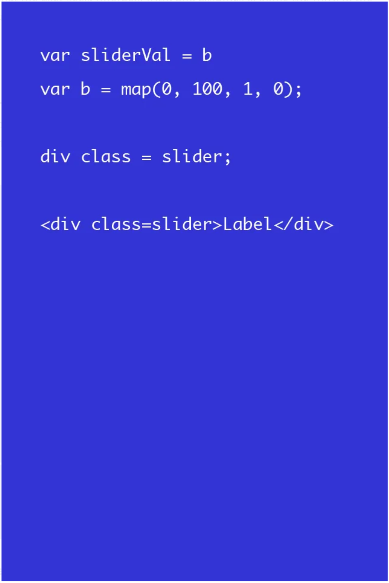
This is how the sausage gets made. This gives people the ability to turn intent into useful information.
Behavior
The interactive layer that helps design the feeling of a mechanism.
Mechanisms
An instrument that is used in the pursuit of function.
Engine
The functional methods by which intent is actually being pursued.

3. Media
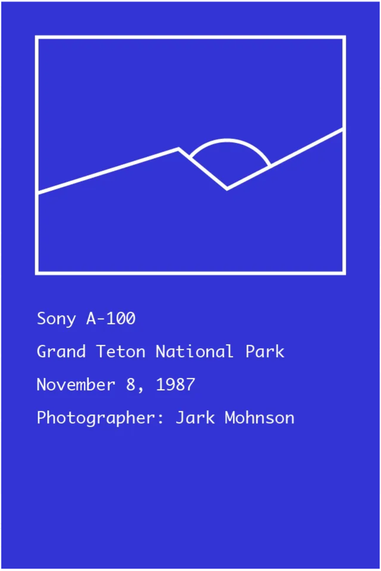
This is the information people want, they way it should be, from the sources they choose.
Content
Any information or media provided by a source.
Context
Any meta or contextual information that needs to go along with content.
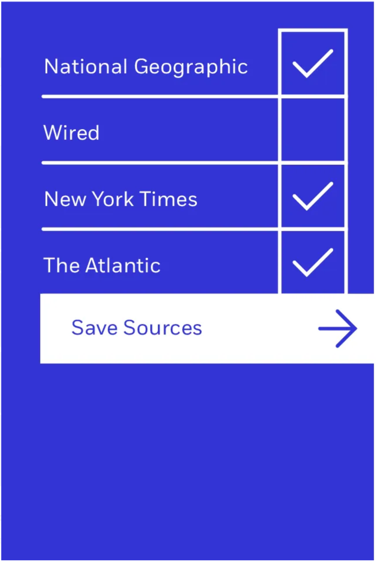
Source
A contributor, creator, or curator of content.
Besides helping create definition, the three pillars of structure allow for elemental growth paths. This means that elements within the structure of Humanic can evolve as needed without refactoring the entire operating system.
Abstraction in harmony
While structure helps define a backbone for Humanic, the pillars and elements should exist as a cohesive experience. No single pillar’s abstraction is useful without the the harmonious entanglement of its counterparts. This is why harmony as a concept must be understood and respected when envisioning, or extending the Humanic experience. Without harmonious abstraction, Humanic is an amalgamation of ideas.
Where the intention of this structure is to define elements, and abstract them at scale, harmony is intended to consolidate these elements in order to seamlessly addresses user intent. The easiest way to understand harmony within Humanic is to conceptually build the system from the ground up. Let’s start at our most crucial element — intent. Without having an intent, there is no rationale for a user to interact with a system to begin with.
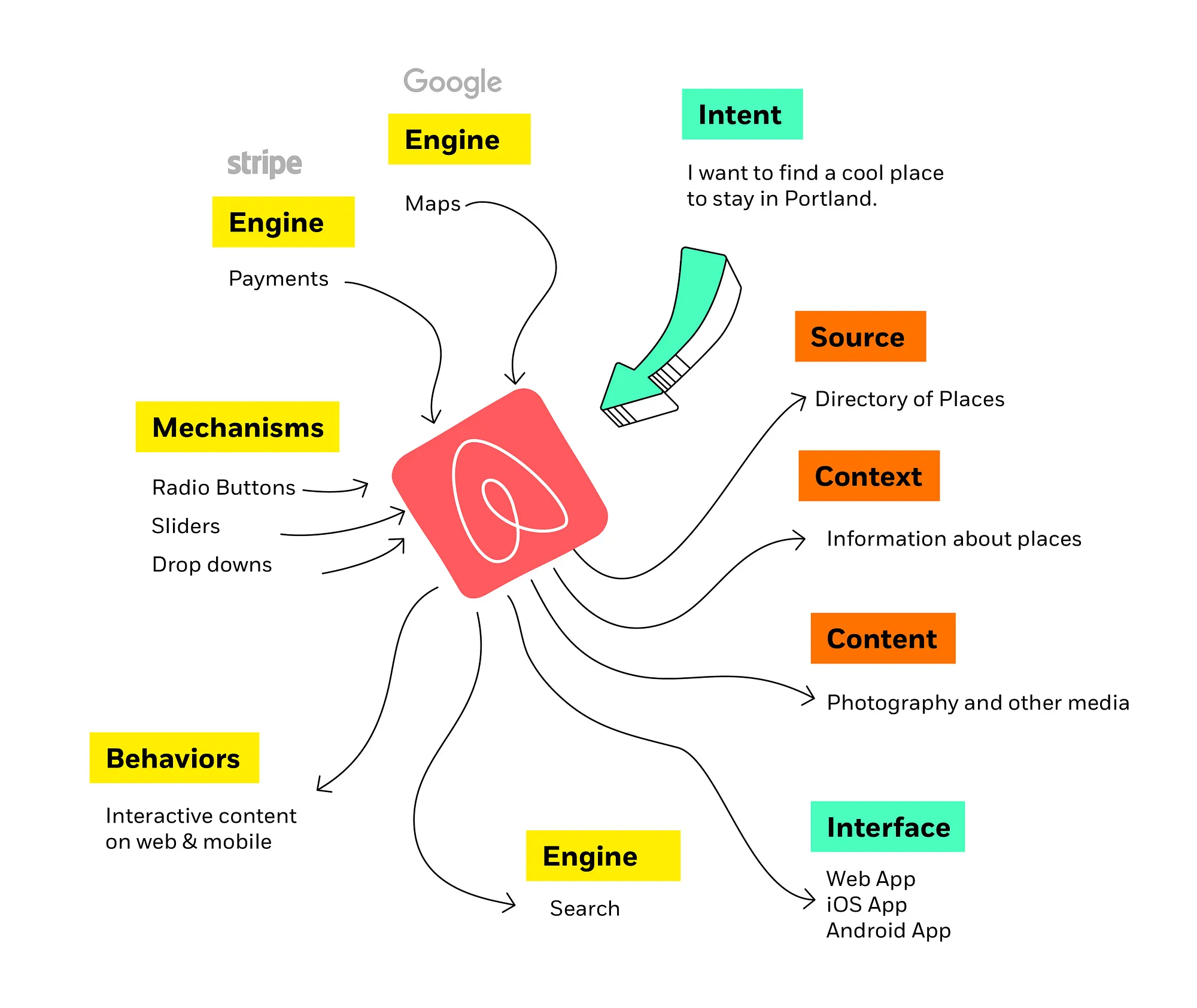
Intent is the first thing a user will participate in–knowingly or unknowingly.
Think about pulling your phone out of your pocket. Chances are it’s not just to put it back in your pocket, you want to create a note, ask a question, or check the time. All of these are intentions.
Once an intent is defined a Function becomes defined. Any defined Function requires an Engine in order to fulfill a users request for that intent. This is what powers any given Intent, and is made interactive by the use of Mechanisms. Mechanisms are interactive tools for users to understand and communicate with the operating system. Think of Mechanisms as translation points between the user request and a system function. They could be radio buttons, combo boxes, date/time pickers, or any method in which a user interacts with the system. Mechanisms are made more evident to users through the use of Behaviors. Behaviors are allusions or metaphors that lead the user to understand how a mechanisms will affect a function.
If the previous paragraph was too much of a dive into this logic, here’s a more practical analogy. Imagine you’re in a car, and you want to go forward. This is communicated to the literal engine through a throttle mechanism. The throttle is interacted with through a behavior, and since you’re in a car, this is likely you pressing your foot into a pedal. If you were on a motorcycle your intent, engine, and mechanism would be the same, but your behavior is what differs. You use your hand and twist on the a handle in order to control the throttle (a mechanism).
Let’s stick with this car analogy for a minute. In the paragraph above, we described an intent being transformed into a function. If we were to analyze the parts described we had one user defined concept, and three system defined concepts. The user defined the intent, and the system (or company) defined the engine, mechanisms, and behaviors. If we were going to go further down this path into the experience spectrum, we would see that the interface, and constitution were also not user defined. If those were to be analogized, the interface would be the way this pedal, in this particular company’s make and model of this car, looks. The way your foot rests on the pedal is setup in the way the company intended, and is the color and material it is because that is what the company intended. And every one of this company’s cars comes ‘standard’ with this sort of pedal. It’s not defined by you, the user. Nothing you interact with in the car is. The way you roll down the windows, the way you turn it on, lock the doors, open the gas cap, or even the colors available to you aren’t defined by the user. They are defined by the company.
It’s not defined by you, the user…They are defined by the company.
Now let’s take this analogy a little further. For the sake of adding some additional tangibles to this situation, we’ll say the car we were using was a Fiat500. Now having driven a Fiat500 recently, I can tell you there were at least two strange behaviors, mechanisms, and interfaces that I dealt with in the car itself. One: In order to lock the doors, you push in the door handle. Two: The controls for both windows are buttons in the center console. These were all selected by Fiat. I did not select the mechanism for the door handle, or the behavior or interface for the window controls. Now in almost every car I’ve ever been in, these functions (locking the door, rolling up/down the windows are done via some interaction with the door). The function here is not the issue for me, the user. The issue for me is the other three parts. I didn’t find it intuitive that the door handle being pushed in was the way to lock it. I would have preferred a different mechanism, let’s say the same one found in a Honda Civic where a rocker button engages or disengages the lock along with an indicator that shows a lock/unlock icon or color. Say I also wanted to move the window control mechanism to the door, but using a button found in a Nissan Altima. I as a user, have an idea of how I want things to look (interface) and how I want to interact with them (behaviors and mechanisms).
I don’t really care what Fiat, Honda, or Nissan want me to do. Nor do I think any of them single handedly can build the perfect car for me, and everyone simultaneously. But that’s the constraint they deal with working in the real world, with physical objects. But those who build digital things have the capability to stop building an application for the lowest common denominator while allowing ourselves to contribute in our strongest suit. Maybe our Map engine is the best one out there. Maybe it’s our scroll bar interface. Maybe it’s our swipe to like behavior. The point is — we don’t all need to rebuild everything, every time. We can build, iterate, and contribute to the best human experience possible, by focusing on the original user intent, and the requirements for that intent.
Why are we doing any of this anyway?
As designers, developers, and entrepreneurs we need to think about this holistically.We need to remember why we as humans are carrying these devices around, rather than focusing on how we’re going to make money with it.
In an era where people have access to such a wide array of information, so much is done by operating systems, and application creators in order to churn a profit in their direction. So much developer time, designer time, and more importantly user time could be saved simply by better examining human nature.
Is it almost noon? Chances are we’re about to look for lunch. But rather than putting answers within arms reach, everyone is required to enter a slog of unpredictable behaviors in order to find an amalgamation of results from a few different sources. For the sake of proving a point let’s just walk through the idea of getting lunch.
- It’s 11:45am, so it’s lunch time.
- A user pulls their phone out of their pocket
- The user unlocks their phone
- The user finds an app like Foursquare
- The user searches or browses for lunch spots
- The user examines reviews, tips, etc
- The user exits the application
- The user opens Yelp in order to find similar, but slightly different information.
- The user searches or browses this application
- The user finds a restaurant near them
- The user looks to find out how much the restaurant costs
- The user looks to find out when the restaurant is open
- The user determines this restaurant to be suitable
- The application by default uses the systems default mapping software which the user does not like.
- The user does a long hold in order to copy the restaurant address
- The user exits the application
- The user finds their preferred mapping software on their phone
- The user pastes the address in the search field
- The user taps a button to get directions to the restaurant
- The user goes to the restaurant.
Time Spent: 1:48
So much time can be saved simply by thinking about this system not just based on user intent, but by human nature and the experiences we all go through everyday. We might all be unique snowflakes in our own wonderful way, but if there are fifty applications completing the same task, chances are the human experience throughout is common, it’s the minutia that’s different.
Part 3
Can a Humanic operating system become real? How feasible is it as a concept?
In exploring the idea of a Humanic Operating System, I’d like to question the feasibility and realities of how it may come to be, and begin a dialogue with you to determine next steps.
Neat idea, but how does it make money?
A great and important question. The answer can vary depending on intent, feedback, and execution. An even simpler way of answering this question is this: It’s up to you. That’s not to say I have no idea, I have some idea. However, I’m a designer and an entrepreneur, not an economist. An economist would be better equipped to answer this question. I am however…the one writing all of this, so here’s a few thoughts, ideas, and considerations.
1. By abstracting the functional components of any given application or service, we create a larger pool of capable workers, customers, and paths to new revenue models.
Let’s look at someone like AirBnB as an example. They’re known for creating a market where there wasn’t one by using design and compelling photography — making a questionable inventory sellable. If I was to tell my Mom that I was going to stay in Flagstaff, Arizona at a strangers house I found on the internet, she would think I’m setting myself up to get murdered. By introducing picturesque photography and designing a robust product they’ve made the idea of staying with strangers feel safe and appealing rather than risky or scary.
Their content and design helped turn an idea into a market. There are many elements of what they built, and what other product companies have built, that are — by and large — ubiquitous elements. And it’s this ubiquity that I think is not only an beacon for a better experience, but an opportunity for a new way to generate revenue.
When you go to airbnb.com, or open up their app, the first thing you see besides a giant background picture or video, and a search box for a location, an input for a start date, end date, and number of people.
Can you guess how many people use this same series of objects within their website and applications? The answer is far greater than zero. Just to name a few off the cuff: Kayak, HipMunk, Orbitz, Travelocity, Booking.com, Priceline, Google Flights, or really any travel, hotel, car rental application. This isn’t even taking into the account this general concept is used beyond the idea of travel related booking — just in order to determine a simple set of parameters.
I want to go to X at Y date until Z date.
Yet here we are — at the DMV version of form hell. Frequently filling out the same information with an inconsistent experience model.
What if as a user, you were able to determine the way this was done — always — no matter who or where you were getting this information from, or where you were sending it to? What if you had an expectation, and it was always met? Would that be a valuable way to save the energy your mind is expending figuring this junk out constantly? I think so. And this place, start date, end date, finish thing is just one example of the repetitive inconsistency we experience constantly as humans. And all we want to fill out is a dumb box.
And here’s the thing. I don’t know about you, but I pay for things that save time. Or things that do something better than something else. The easier it is to sell me on something, the more likely I am to buy it.
If you’re trying to sell me on using Orbitz over Kayak, we’re going to have to talk about it. What are you selling me on? The price? The experience? The service? There’s so much to sell, and the cost of selling is high.
My bet is this:
- Selling components is easier than selling an application.
- Markets can be created and defined by establishing and evolving intent.
- More profit can be generated by not maintaining a staff to manage incompetencies within a company.
Here are a few scenarios to illustrate this point.
Scenario A
I’m trying to sell houses in Las Vegas. I know that these houses exist, but I don’t know anything about photography, which might be crucial in order for me to you know…sell houses. In todays terms, we’re talking about going out and finding a web designer or developer and a photographer, hoping that somehow we can pay these people to make something so that I can sell these houses. Here’s the thing. This is going to cost me money. I don’t know if it’s going to work, and I definitely don’t know how to fix it if anything breaks. So the service I’m about to provide — will not be my core competency.
Now let’s take this same person, and imagine a world in which Humanic exists. I can now simply be a Source of information, and generate revenue as a Source. I know these houses exist, at XYZ place, and that information is valuable, just not without the parts I’m not competent at providing. Perhaps if I’m able to market myself as a source of great information, I’ll lead myself to greater streams of content creators such as photographers, or videographers — working to help me sell my houses. We both have vested interest, and can both profit in different ways.
Scenario B
I’m a person who shops online. Believe it or not, just like in real life, I don’t only shop at one store, I shop at many. Amazon, Delta, Frank and Oak, Flexibits, Adobe and who knows where else. You get it — I don’t buy everything from one place. I buy many things, from many places. Unlike real life however, the way I check out is without fail, a shit show of inconsistency.
There are a couple of quick and easy points about the checkout process itself that are simply infuriating, and definitely do not mimic real life payment procedures.
In real life — I’m paying cash, credit, debit, or check (If it’s 1992 and I’m watching Coming to America. Or if it’s 2016 and I’m paying rent). I have my widget or whatever it is that I’m buying, and sure the cart process is different, but when it comes to paying — it’s always the same. And if it isn’t, I’m definitely confused. On mobile and online, you’re dealing with people like Amazon that are A/B testing their checkout process to make it as flawless as can be, and people who sell widgets on their website who paid some web developer to make them a Wordpress site with payment plugin they found. How do you think that is from an experience point of view? Security point of view? Or literally any other point of view? It’s awful, inconsistent, and unreliable.
What if you could say, “Look, I don’t care where I buy anything from, the payment goes through this checkout process every single time. I the user have determined that I enjoy using Stripe’s checkout and payment process the most. And if I’m buying anything, I’m using this familiar experience to do so.” This idea leads to idea 2 for revenue generation.
2. Sharing is caring.
By abstracting the processes used throughout this system, payments can trickle through so to speak. I’m not trying to use Reaganomics on this, but trickle-through is roughly what I would see happening.
What Humanic is most dedicated to doing is translating intent into action and information. We should not be focused on designing and developing custom applications, but rather the components that can improve the methods by which user intent is best translated. What this means is not only can we better meet user intent, which is great, but we can more easily track the components that impact the bottom line of any service or sale as well. Assuming we can do that, perhaps we can share profit accordingly.
If I’m AirBnB, and I have the listings I’ve got, and I can track that this Map view results in more sales than another map view, should I not be paying some sort of kickback there? If I’m Best Buy and I see that users browsing my inventory in Interface A buy more than Interface B, should the inventory not get a kickback? Perhaps yes, perhaps no. But either way I believe those are monetization options. Maybe the user just loves browsing in a certain way, so much so that they would pay to do so. Maybe they should be given the option to do so, and it shouldn’t really be the choice of the provider of inventory, content, or what have you.
When it comes the the Humanic economy, I see a correlation between user behaviors and economic impact. A place where inventory holders are able to provide content and generate more revenue by allowing those who build better functionality, and experiences do what they’re best at.
If we look at the way apps have connected us to the real world without having to physically participate. Think about what impact abstracting the world in our pocket would do. Not just to the bottom line, but to how we can solve problems, hone in on solutions, and ultimately build better human experiences.
If you build it, does it matter?
A large part of why I started thinking about this concept was simply because I was wondering what happens to the devices we’ve used and discarded. And what this means for emerging markets. Does this mean we’re about to do 200% more damage than we’ve already done building new devices and distributing them to even more people, just to have them discarded? Would it be feasible to build a lightweight barebones system for older devices while delivering basic content to them? Would that benefit emerging markets? Could we give old devices new life, and an update that makes them useful to those who never had a smartphone before? Or maybe those who have but just don’t want new stuff, they just want basic stuff.
Can you just tell me how the heck to get home? I don’t know where I am. I have to visit my family for Christmas, when can I go, and how much does it cost? Is there any decent food around me? I’m starving!
I’m not asking for some sort of CryEngine test for phones. I’m asking for the opposite. What’s the lightest thing I can build to make an old device useable. And if I’ve got a device that is new, or powerful, can I give myself a ubiquitous experience that I enjoy, am familiar with, and can customize to my liking? Where’s that device? Where’s that system? How do I get it?
How does this happen anyway?
The questions, “How does any of this become real? Should this be real? Does anyone care about this?” come to mind. It would require a lot of work, and may not end up being exactly as I’ve written, but that’s how most ideas end up. Not exactly as described. Sometimes better, sometimes worse. But it’s hard to know without trying, and I’d rather start somewhere.
If any of this is resonating with you, the next step for you would be to engage with me in a dialogue. Whether that means discussing how humanics as a concept may apply to other industries, or feasible technical paths to making Humanic as an operating system a reality. I don’t want to build this thing alone, and I certainly don’t have the answers to it all, but if we can start to question the ways and reasons we’re building things—I’ll be happier than I was when I started writing this.
Reading Complete ✅
If you’ve managed to read this far, you have read all three pieces of the Humanic trilogy and I can’t thank you enough. I’m not looking for shameless promotion…but I am. So please share this with your friends and say hi to me on the internet somewhere. Or shoot me an email at mark@budbud.co
*
The statistic depicts the total number of smartphone users worldwide from 2014 to 2020. For 2016, the number of smartphone users is forecast to reach 2.1 billion. The number of mobile phone users in the world is expected to pass the five billion mark by 2019.
Number of smartphone users worldwide 2014–2020 | Statista
In demographics, the world population is the total number of humans currently living. As of August 2016 , it was estimated at 7.4 billion. The United Nations estimates it will further increase to 11.2 billion in the year 2100.
World population — Wikipedia


