Abstract
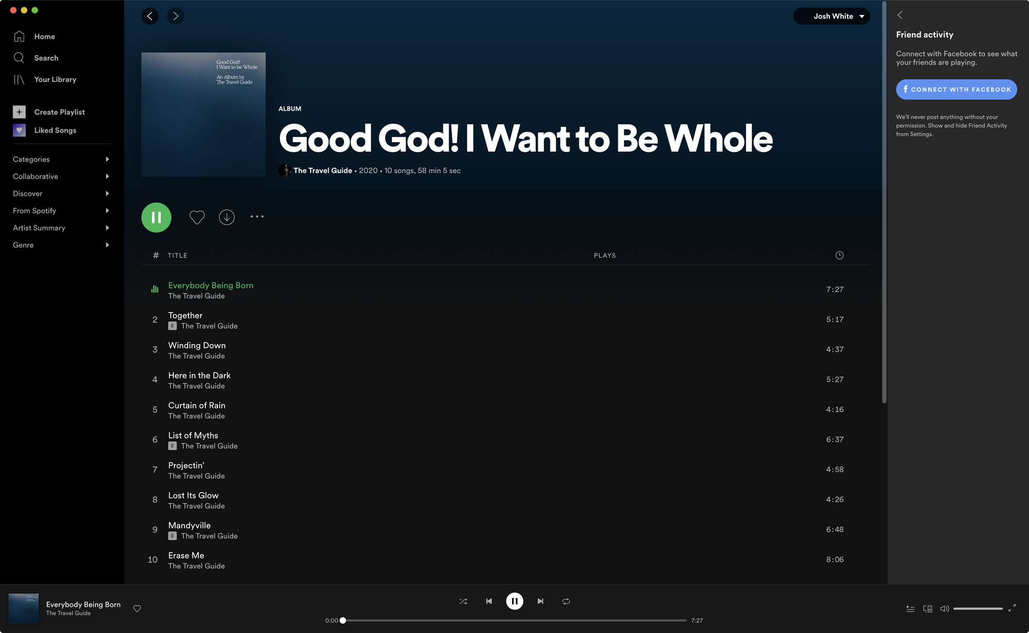
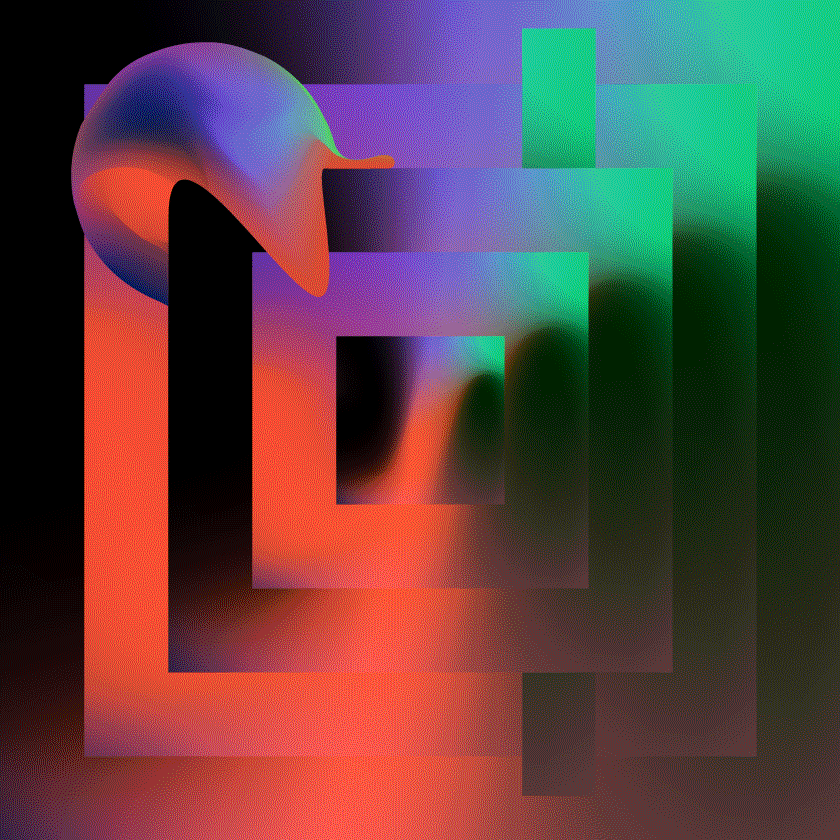
In 2020, my friend Thayne, under the moniker The Travel Guide, released a second album. I drew some art for it. Album art prefaces sound. What you see sets the stage for what you hear. It's a fun communication opportunity in visual design.

Try it sometime, if you haven't. Here's how I go about it. And what I learned from a recent experience. My ultimate goal is to share with you a repeatable process for creating conceptual art, told through a case study.
Ideas in brief:
• Collaboration is the strongest salesman.
• Everyone is creative.
• Shared moodboards add clarity to abstract conversation.
• Copy is art (and art is implicit copy).
• Experimentation creates understanding.
• Discover, concept, experiment, execute.
Discover
Thayne has a strong mind for conceptual ideas in songwriting. I brought him along for the journey. Collaboration is brilliant. I'm not a good salesman. I'd rather we get to ideas together. Go with the river.

The album would be heard primarily on Spotify (or else, live). We looked at album covers from artists that inspire Thayne. I asked questions to understand his interests. What do we see? How is communication happening? What can we learn from the art & copy?

We talked about themes in the record. What is the tone? How does it feel? How might we give art and story symbiosis? The songs explore austere, pleading, and accepting experiences. Intriguing themes for visual fuel.
We exchanged reference images. A shared moodboarding approach adds clarity to abstract conversation. We gravitated to artful typography, a full canvas, and mechanical composition with human intervention.
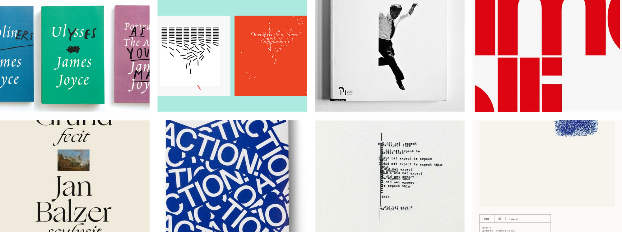
Book jackets are a strong analog for album art. You want to communicate a key theme, without giving away the ending. You want to send a coded message that reveals itself after experiencing the content. Creativity thrives in constraint. We zeroed in on a lyric that captured the spirit of the whole.
"Nothing ever ends. The void gets into everything. Light is forever unwinding. We're adding nothing into none. Values cancelling. Pushing hard against the sea."
Concept
The album is titled "Good God! I Want to be Whole. An Album by the Travel Guide." That name contains wonderful emotion. We explored concepts that put the title on display. We felt these ideas could be beautiful if analog-printed on a 12" vinyl sleeve. They felt less impactful in a 160px Spotify thumbnail.

Other concepts explored austerity, absence, counterpoint. The ideas manipulate foreground and background to create interplay between art and copy. The graphic technique felt interesting, but lacked the optimism heard in the music.

We began to explore out-of-focus, textural photography. We selected images that evoke the interstitial experience of calm before or after a storm. Melancholic blues giving way to warm light. We wanted to capture how it feels to be just on the other side of resolution. Optimistic liminality.

Experiment
After deciding a concept, we discussed how we might bring greater meaning and intent to its elements. How might we enhance the communication without losing what's singing in the concept sketch? It was important for us to guide our refinement with decisions rooted in the music.
We aligned on a shared vocabulary of design elements. Then unpacked available creative affordances. We decided to explore variations to typography, composition, and gravity.

The sketch was typeset in Mercury Display. We aimed to test confidence in that selection. I typeset the album title in a range of serif families of disparate characteristics. In doing so, we discovered Cooper Light evoked a humbleness inline with the album's lyrics.

In the concept sketch, breaks and columns help readers to parse the title and artist. We sought a composition that would feel unimposing on the art, but also not invisible. It's tough to make a decision here without experiencing the relationship of the copy to the image.

We riffed on the texture of the artwork. The image is isolated from a photograph of the sea (or perhaps the forest?) at sunset (sunrise?). Film-grain and blur disguise time and subject. We sought to preserve the interstitial feeling. By adjusting how the image is cropped, we could steer interpretation. Am I looking at the sky? The shore? The sky reflecting off water? Am I underwater?

We distilled to three variable concepts. To make a decision, we looked back to our key themes. Which variation would best express the intended mood? The second concept, underwater, puts the listener into the perspective of the writer. You are not watching someone push against the sea — you are that person.
"Nothing ever ends. The void gets into everything. Light is forever unwinding. We're adding nothing into none. Values cancelling. Pushing hard against the sea."
Execute
Executing local album art for digital release is a much simpler process than physical release. You're designing the primary display panel. No back cover nor interior jacket. No dielines, mechanicals, press checks. I miss the camaraderie of that process, but appreciate the effectiveness and efficiency at which artists can now produce and distribute music.
I exported the art at high resolution and sent to Thayne via iMessage. He uploaded the album later that week. It released a month later. Easy breezy. Listen to "Good God! I Want to Be Whole. An Album by The Travel Guide" on Spotify.
